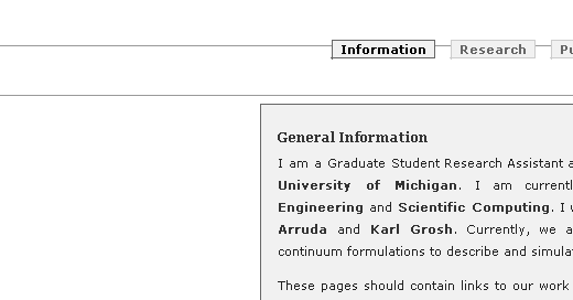
Spent some time in the evening working on the backend for our friend http://umich.edu/~hnarayan
All was well until I checked it on Internet Explorer. For some reason it wants to render arbitrary lines which just mess things up.
How it should look, as rendered in galeon.

How it looks on IE.

If people with different versions of IE confirm this I will be a happier man. Now I need some sleep.
the extra line comes and goes. it’s very strange. i didn’t notice it the first time i looked…but that may have been because i was distracted by the font used for the headings.
Distracted in an “Oh, such a preeettyy font” good way :)?
Thank ye for the feedback. I have stopped worrying about it chalking it down to browser weirdness which I hope they fix sometime.
um, no, not really distracted in that way :)
but it looks better in the galeon version, which is what you intended.
Will look into alternatives. ty, again.
I really ought to have tested it first on the browser 97% or whatever of the population is going to be reading it with.
I wasn’t entirely bright.