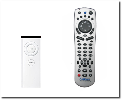
I kept telling myself I wouldn’t do this, but here it is: A partly-geeky, no-real-news filler meta-post.
I am clearly not qualified to comment on things of this nature, but that hasn’t ever stopped from opining before. On looking at shots of this journal rendered in Safari on MacOS X (looking just the way god intendedTM), I realised I’ve inadvertently gravitated toward a sort of Applesque way of doing things.
As a younger lad, I’ve spent an inordinate amount of time mucking with things like Xfree86 config files, tweaking device drivers for esoteric hardware support in the kernel, and much much more under the guise of “better performance” or something non-concrete like that. I’m calling it “non-concrete”, because I didn’t really have a metric of performance. I just felt that if I put in the time, the results would definitely be “better”. This is the sort of mentality that drives a good portion of the gentoo users, I am sure.
But as I’ve gotten older, I realised I “just want things to work”. I’ve stopped staying up-to-date with the latest hardware and OpenGL drivers just so I can get 3 more frames per second on some game. I’ve stopped modifying and building most things from scratch just because I can. None of that. I want to just push a button and everything to work automagically. I don’t want too many things to make-sense-of staring right at me all the time. I head home late in the evening, I power on the GameCube, within 5 seconds I’m mashing buttons—the way it ought to be. Nintendo realises this, so they’re going to make sure their next generation console caters to the less hardcore in the audience as well.
But what I really wanted to get into today was the redesign of this journal. Rather than get overly verbose, the following images just about exemplify what’s going on.

Which of those would you rather use?
I saw this earlier in the context of comparing GNOME and KDE, but the analogy holds here as well. Are things really that much more functional when you have 14,000 links on a page? What about when the text is teeny-tiny centred in a small column somewhere in the middle of the screen? Is that why people spent so much money on their large screens which can work at some egregious resolutions?
I think not. So, this is why this site is now the way it is. This is what I meant by an “inadvertent Applesque gravitation”. And, as much as I hate the company and its rabid community, they really do have some things going for them.
People who are more skilled or qualified in terms of marketing or design may have conflicting views, but I am a simple man, with none of that knowledge.
Obviously your priorities are changing. Now, you’re interested in using the machine more as a tool to get things done rather than a fun way to fool around and possibly learn random new stuff. And I don’t think that’s very surprising. It’s just that you have other important things to do!
I don’t really do anything. It’s not like my life-circumstance has suddenly changed and I now have this huge pile of important things to do. It is just that my threshold for putting up with things that don’t work easily is dropping as I get older.
I still like fooling around and learning random stuff. I just don’t want fooling around to feel like work in itself.
Well, for what it’s worth, you’ve given me a “virtual kick in the pants” and gotten me to rethink what my blog was for and why I started it, to bring things back to basics, to clean serenity. I echo the sentiments in your last sentence above: I … don’t want fooling around to feel like work in itself.” Absolutely correct, because when that happens, it surely quits being fun, or rewarding!
I’m glad that my actions inspired somebody. People do tend to get caught up in the bells and whistles (as have I) and stop seeing the real point of it all.