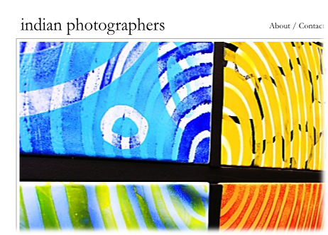
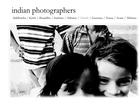
(Because I have so much time to work on my core strengths…) I’ve decided to work on a new web site to showcase the work of some talented Indian photographers. These designs are preliminary, but what do you think? Which do you like better? Why?
I intend for things to eventually feel like this site.


I’m a fan of the first one, simply because I like color over black and white in most cases.
Second one looks pretty cool. One question.. how do you browse between photos.. or is there another browse screen?
Thanks Michelle!
It is AJAXY goodness. Clicking on the left half of the image takes you to previous one and clicking on the right takes you to the next one. Refer the site I’d linked to for a sample implementation.
Pundit, haven’t seen any updates at your photoblog lately; thus coming over here to see what happened. Nice clean look. Hope you’ll get some updates soon. By the way, have a flickr account?
do put thumbnails somewhere..its so much easier then to click on fav pics..then go thru the whole gamut..
And i like the format of the one the bottom.
stchatterbox: I haven’t been taking very many photos lately, and hence the lack of updates. I don’t have an active flickr account; when I resume taking pictures they’ll end up in my photolog.
niyati: Thanks! That is part of the plan. I am trying to figure out how to work it in. I have a few ideas, but nothing concrete.
i like the top layout better. prefer having the about, contact, etc at the top and the list of names at the bottom, especially if the list of names might grow to more than one line.
Yes, that makes sense. Thanks for the input!