I’m working on the style of the new photo page. What say you?
The thumbnails themselves will be dynamically updated once all the style issues are sorted out. And it works differently on Mozilla and IE.
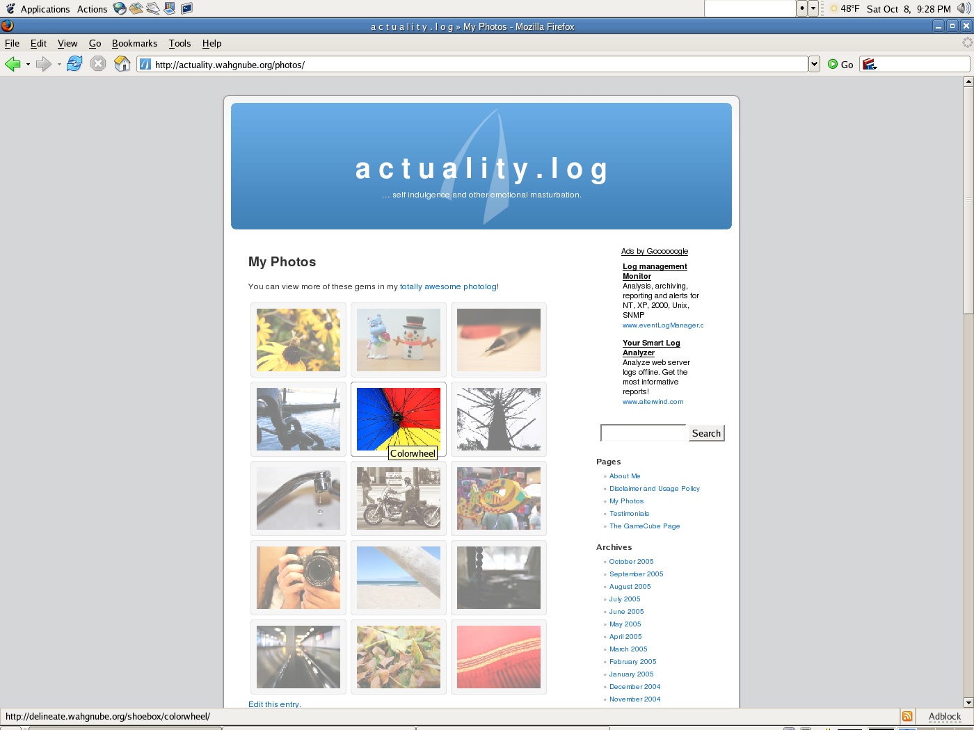
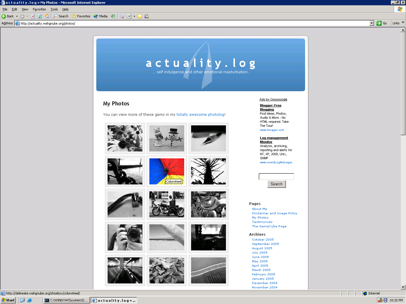
Update: So as it stands, the somewhat stabilized versions render like so: Firefox 1.0.7 on RedHat Enterprise Linux 4 and Internet Explorer 6.03790 on Windows Server 2003 Enterprise Edition (the crappiness in colour depth is because this is via a terminal server client).
Does the transparency or the greying out tickle your fancy?
Update 2: Of course, the final goal is to find a scheme that works for delineate’s archives.
Looks neat. I like the collage look.
when i mouse over any of the pictures in the left column, the pictures in that row seem to shift over to the left a bit. didn’t seem like that was intentional, so i thought i’d point it out.
but in general it looks good.
Adi: Thanks!
anita: Yes, I noticed it and it annoyed the hell out of me initially. I was trying to thicken the border when the mouse moved over to give you a feeling of selecting something, and IE decided to interpret this as move all other elements a tad.
I’ve just made the border darker as you go over it now. It serves the purpose, without the annoying one pixel movement.
Thanks!
Some (non)intentional white gaps (when viewed using Firefox 1.0.7):
In particular, ‘second row second column’ and third row.
Placing them without any gaps would make it look nicer.
I don’t see what you’re talking about. Screen shot or something perhaps?
Here’s one. http://www.geocities.com/msrinath80/images/harish.png
Drop your font size by 1 (cntrl+-) and let me know if it still shows up. It is not designed for fonts that blocky.
Edit: Actually, I don’t think that’s the problem. I just scaled my fonts here a great deal and nothing happened. I probably have to increase the width of the content area just a little. Does what you’re showing happen when you mouse-over or page itself just shows up like that?
Did you see that? The whole page layout has changed. It now looks more elegant. The screenshot was exactly what I could see. Now, if I move my mouse over I can see the stuff you guys were talking about. This is so random :( Any ideas on what’s happening?
It showed up just like that when I clicked on the link.
I will look into it. Here’s how it renders (and I how I want it to) here: Clickey!. The brightly coloured image is where the mouse is.
Yours looks like what I would… hmm, force refresh and tell me if the problem persists. I am fairly certain it was rendering the new page with an old style-sheet.
IE people will see it in black and white and it will colorify on mouseover. I can do the same opacity thing there too, still debating.
Now, it looks just like your screenshot.
That’s it. I defined some fancy schmancy image behaviour by updating the stylesheet, and your browser was rendering the new html with the old style from cache–ergo the images were still their original sizes and none of the fancy framing tricks kicked in.
I don’t really see why you have to toil so much for IE compatibility. By now, a majority of windows users should have switched to Firefox?
Oh, and the rendering looks great. Can I have a copy of the stylesheet?
Not what I see when I analyze my apache logs. There is a scale difference between the last 6 months and 6 months before that, but IE users still are a large portion of the crowd.
The only people I genuinely don’t care about are Opera users. And KHTML, of course.
Just browse this code and find the css.
Edit: Clickey! It is totally non standards-compliant, but who’s really checking? It is derived from O.R.I.G.I.N.A.L‘s stylesheet.
Thank you Daisy ;)
The first thing that catches the eye in the IE screenshot is the crappiness of font rendering.