I’ve been comfortable with the way things have looked around here for a couple of years now. In many ways, I still am, but here are a few ideas I’ve been toying with every now and again. I was wondering if you had any thoughts on the matter.
1. Simplicity two point oh two: Using this would be the laziest route, but I know it works well for different sorts of content. I think it needs some sort of slick header to complete it, but I know not what.

2. Daily read: This stemmed from something I read a while ago which said “People tend to take sites that look like ‘news sites’ far more seriously than they do blogs.” And we all want to be taken seriously, don’t we? (The eagle is just a placeholder logo.)

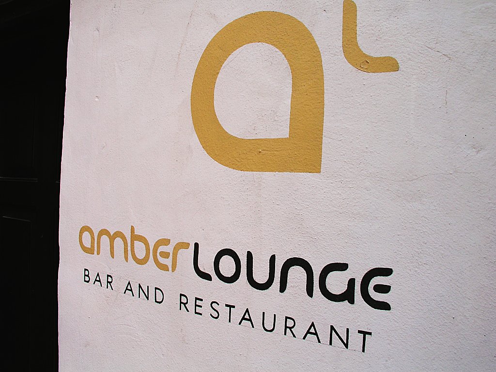
3. Amber lounge: The logo for this was stolen from a bar I visited while in Europe. It is the latest line of ideas I’ve been tinkering with, and the least fleshed-out.

Perhaps the best elements from each will be amalgamated.
I’ll suggest a combination of 1 and 3.
Oh and help me with the simplicity theme na! I sent you an email, am not able to install it in WordPress.
I kinda like some elements from each of them. 1 is the slickest, but most stale (since I’ve seen it so much). 2 is extremely functional but damn it, I am not running an on-line newspaper site. 3 has potential, but is right now little more than a toy.
(My internet activity is sporadic.)