Experimenting with Google+

A lot has been going on in my life but I’m finding it difficult getting motivated enough to write about things. After mulling over this for some time, I’ve now decided try my hand at publishing over at Google+ for a while. I’m hoping that the change of scenery will give me the motivation I need to write. I am not sure if it’s worth giving up the anonymity of this journal, but I plan on experimenting anyway.

If you’re interested in following further happenings in my life, add me to your circles on Google+. If you aren’t on the network and would like to get in, here’s an invitation.

Happy stalking!
Bottled goodness

I’ve been experimenting with different looks for the journal, but I’m repeatedly failing to put together something I like.

An advertisement

Imagine the possibilities if I detach myself from shades of grey; not like that’s ever going to happen.

Update: After talking to a bunch of designer people:

An advertisement

Time for a visual refresh?

I’ve been comfortable with the way things have looked around here for a couple of years now. In many ways, I still am, but here are a few ideas I’ve been toying with every now and again. I was wondering if you had any thoughts on the matter.

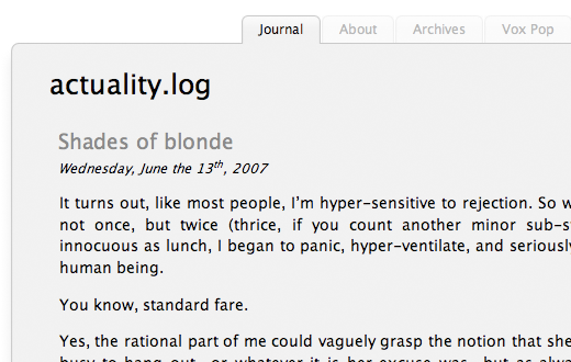
1. Simplicity two point oh two: Using this would be the laziest route, but I know it works well for different sorts of content. I think it needs some sort of slick header to complete it, but I know not what.

The first design option

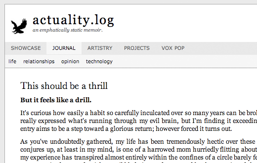
2. Daily read: This stemmed from something I read a while ago which said “People tend to take sites that look like ‘news sites’ far more seriously than they do blogs.” And we all want to be taken seriously, don’t we? (The eagle is just a placeholder logo.)

The second design option

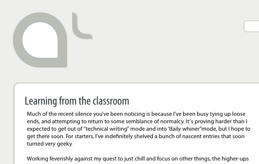
3. Amber lounge: The logo for this was stolen from a bar I visited while in Europe. It is the latest line of ideas I’ve been tinkering with, and the least fleshed-out.

The third design option

Perhaps the best elements from each will be amalgamated.