A month and three days, give or take a few months
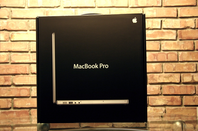
One month and three days; that’s how much time had elapsed since I first ordered my shiny new Apple Macbook Pro (henceforth, MBP) and actually received it. As happy as I’ve been about how laid back people are here—and how much more relaxed my own life has become after moving to Oslo—it’s gratuitously long waits for just about everything (opening bank accounts, receiving my first salary, finding an apartment, getting this computer, …) that have tended to annoy me. But I think I’m going to save that rant for another time, as we seem to be veering off-topic a lot quicker than usual today.
I’d been keeping my eyes peeled for a new computer ever since I stepped out of grad school early this year. And since my existing MBP (first generation, early 2006 model) had served me well for so long (and continues to do so), it wasn’t surprising that I decided to eventually augment it with another MBP. I amn’t sure why it took so long, but only when the new crop of Apple notebooks were announced in mid-October was I both excited and intrigued enough to take the plunge.
A day after the new rigid-bodied, fully-glossy, black-keyboarded, easier-to-upgrade line was announced, I ordered myself one of the higher end MBPs. One month and three days later, I received it. It’s in this interim that my enthusiasm for the computer (and for this review in turn) seems to have waned.
But not completely extinguished.
Similar, yet different
When I first envisioned this piece, I imagined it to be some sort of spoof on my earlier (now nearly three year-old) review of my first Apple notebook, a first generation MBP. Retaining stylistic similarities, I wanted to faux reproduce the effusive excitement that came with my fledgling foray into the world of Apple and Mac OS X—mocking how much I associated that move to something of a noteworthy lifestyle change. I also wanted this review to stand alone, not marred in comparisons to that machine. But as usual, it appears as if this piece is going to evolve into whatever it wants to be—which is entirely comparative, and not particularly funny.
So without further ado, I present a complete list of specifications of my new machine, along with the specifications of my older machine to shed some light on where I’m coming from.
| Early 2006 Model | Late 2008 Model | |
|---|---|---|
|
||
| Model Name | MacBook Pro 15” | Macbook Pro 15” |
| Model Identifier | MacBookPro1,1 | MacBookPro5,1 |
| Processor | Intel Core Duo (2 x 2.0 GHz) | Intel Core 2 Duo (2 x 2.8 GHz) |
| L2 Cache | 2 MB | 6 MB |
| Memory | 2 GB (2 x 1 GB) | 4 GB (2 x 2 GB) |
| Type (Bus Speed) | DDR2 SDRAM (667 MHz) | DDR3 SDRAM (1.07 GHz) |
| PCIe Graphics Card | ATI Radeon X1600 | NVIDIA GeForce 9600M GT1 |
| Total VRAM | 256 MB | 512 MB |
| Display Type | Matte Color LCD | Glossy Color LED |
| Resolution (Color Depth) | 1440 x 900 (32 bit) | 1440 x 900 (32 bit) |
| Audio Card | Intel High Definition Audio | Intel High Definition Audio |
| Hard Drive Model | Seagate ST910021AS | Hitachi HTS723232L9SA62 |
| Capacity | 100 GiB | 320 GiB |
| Drive Speed | 7200 RPM | 7200 RPM |
| Optical Disc Drive | Matshita DVD-R UJ-857 Single Layer |
Matshita DVD-R UJ-868 Dual Layer |
| Battery Model | SMP ASMB012 | SMP bq20z951 |
| Full charge capacity | 3219 mAh2 | 4585 mAh |
| Amperage / Voltage | 2597 mA / 12446 mV | 2168 mA / 11700 mV |
| Connectivity, etc. | USB (x 2), Firewire (400 MB/s), Gigabit Ethernet, Airport (ABG), DVI Port, Bluetooth, Audio in/out, ExpressCard/34 Slot |
USB (x 2), Firewire (800 MB/s), Gigabit Ethernet, Airport (ABGN), Mini DisplayPort, Bluetooth, Audio in/out, ExpressCard/34 Slot |
| Height x Width x Depth | 1″ x 14.1″ x 9.6″ | 0.95″ x 14.35″ x 9.82″ |
| Mass | 5.6 lb. | 5.5 lb. |
Henceforth, I’m going to refer to my new machine (fifth generation, late 2008 model) as MBP5, and the older one (first generation, early 2006 model) as MBP1. I think this notation will save me some typing.
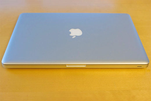
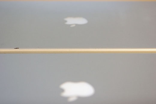
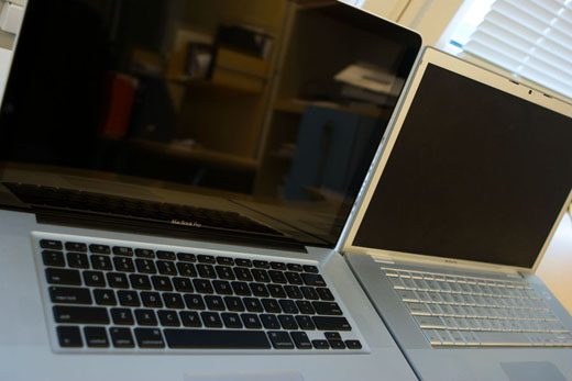
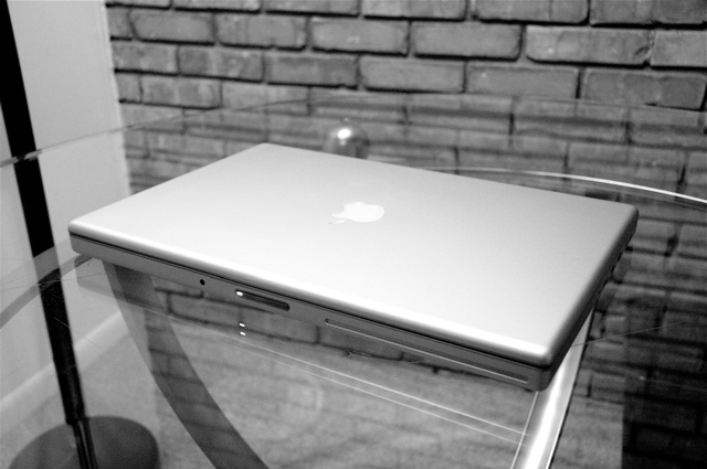
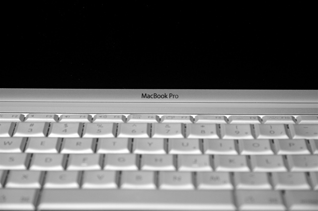
The two machines are quite similar in a lot of ways, yet I’ve convinced myself the differences between them are sufficient to justify this upgrade. When closed, and you stare at them from far enough away, the two notebooks appear just about the same.
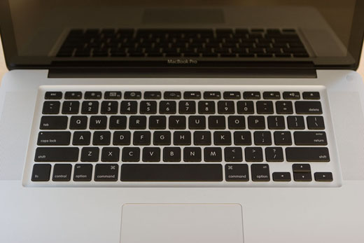
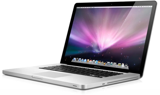
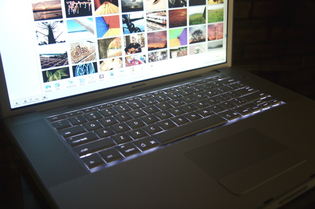
But as you get closer and you actually get to hold the newer machine, the physical differences between them become clear: MBP5’s keyboard now sports black, separated keys, the already lonely mouse button on MBP1’s trackpad is gone, the screen is now fully glossy and sports a black bezel (much like the iMacs), and most strikingly, it’s apparent how much better-built MBP5 is.
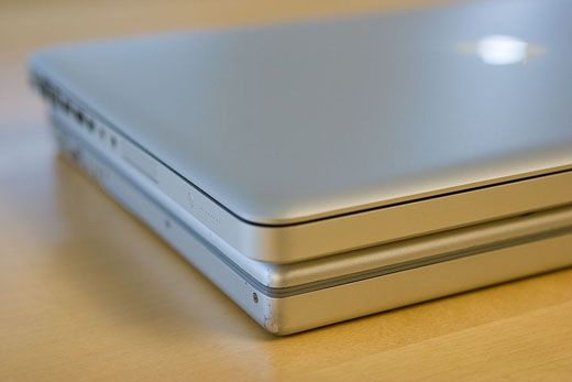
Apple has banged-on about their new manufacturing process innovations for quite some time now, and so I’m not going to repeat any of it. Even without caring about the details, the first thing I noticed when I pulled this machine out of the box is how much more rigid (and dense) it feels. The specifications on paper claim it is slightly lighter than MBP1, but I hold them up side-by-side and I can swear MBP5 is the heavier machine. Also, MBP5 is slightly thinner than MBP1, but in order to achieve this, they’ve made it wider and longer. Either way, you won’t really notice any of this unless you press them up against each other.
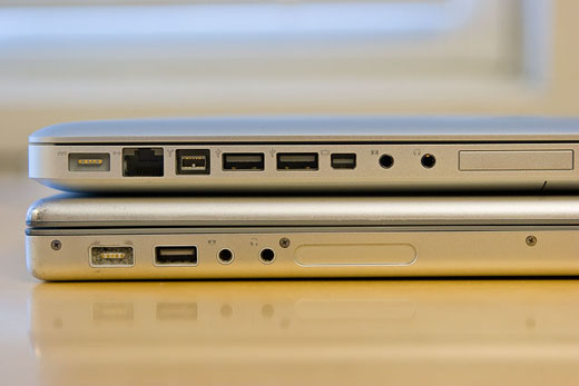
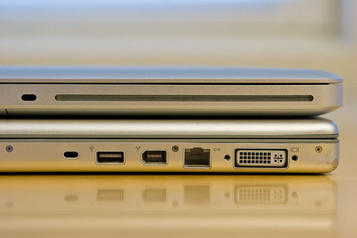
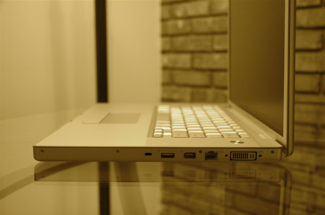
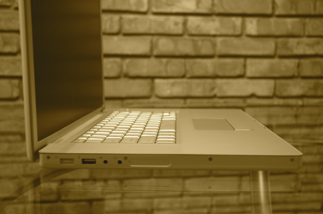
Since this section of the article seems to have become preoccupied with physical differences between the two machines, I might as well point out a few more things. First, all the ports have been moved to the left side of MBP5’s chassis, while they were distributed somewhat evenly between the left and right sides on MBP1.
This also means that the slot for the optical disc drive on MBP5 has been moved to the right side of its chassis, instead of showing up at the front as in MBP1. These changes can either hurt or help depending on your set up, but either way, the drive on MBP5 sounds so much more tranquil—and not like it’s going to die every time it’s operated!
Also, even though the positioning of the keys on MBP5 feels identical to that on MBP1, some of the keys (especially the Function keys that open Dashboard, Exposé, help change the volume etc.) are mapped differently.
I’m a little thrown-off by this right now (like accidentally increasing the volume level on MBP5 by hitting F12, when intending to open Dashboard), but this is something I will adjust to soon enough and develop the appropriate muscle memory for. In more important news, that god-awfully placed Enter-key right next to the Left arrow-key on MBP1 is now gone! No more accidentally sending embarrassing typo-laden instant messages when you actually planned on moving the cursor left to an earlier point to correct your message. Thank you Apple!
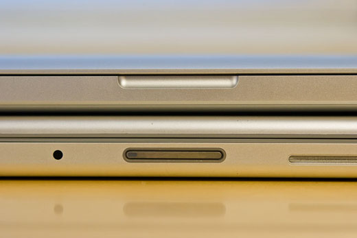
Finally, unlike MBP1 which uses a physical latch to stay closed, MBP5 uses a magnet. While this is cool (it really seems to shut snug), my fingerprints will probably end up smudging the glass covering the web cam—since that’s exactly where my fingers need to be to open this magnetic “latch.” Genius.
Some false alarms
Once the initial excitement of actually holding the machine in my hand had passed (recall I waited over a month for it), I proceeded with the cursory visual inspection of the body and then turned it on to check its behaviour. Within the first few minutes of use, it was apparent to me that I really liked the new keyboard. MBP5’s keys were a bit stiffer and typing on it had a really solid feel. In case you are worried about the new spacing between the keys (as I was), don’t be; it’s a non-issue.
Another thing I was unsure about was how the new button-less trackpad would behave. After using it for a week, I can testify that MBP5’s trackpad feels smoother, and the process of clicking is identical to that on MBP1—even though you can’t see a button any more. However, the clicking noise MBP5 makes sounds yuck compared to MBP1 (MBP1 sounds smoother and more understated while MBP5 sounds cheap and clicky). I haven’t gotten around to using (more than two-fingered) gestures yet, but I guess they will work as advertised. Most salient from my point of view, none of my usual finger movements on the pad have been accidentally construed to be gestures; which is always a good thing.
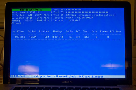
After working through the initial set up (for the first of three times—when I first switched-on the computer, when I formatted it and reinstalled Mac OS X to remove auxiliary crud, when I needed to reformat it and re-reinstall Mac OS X because I later found out many programs dislike a case-sensitive file-system), I did what I always do when I get my grubby-little hands on new hardware: Put it through its paces. Popping in an Ubuntu CD lying around, I fired up a memory test (imaginatively named “Memtest”) and let it run for a few hours.
Much to my dismay, the test failed quite spectacularly, indicating I had faulty memory. I was annoyed and disheartened not because of the failure, but because of the prolonged holdup I knew I would experience trying to get the faulty memory replaced in Norway. Thankfully, it ended up being just a silly software versioning issue, and MBP5’s memory wasn’t to blame. I guess the older version of the software just wasn’t aware of fancy Apple proprietaryisms. I’ve since run more recent versions of Memtest on the machine over several hours and there haven’t been any problems.
One thing I noticed during the test (which, apart from taxing the memory, is also a fairly processor-intensive task) is that MBP5 runs a smidge cooler than MBP1. The newer system’s cooling fans seem to be kicking-in earlier. While this is good news for you if you ever plan on having children, it makes MBP5 quite a bit louder.
Talking about noise levels, I would be remiss if I didn’t point out that MBP5 is completely non-whiny! This is in stark contrast to MBP1, which has different kinds of high-pitched electronic noises emanating for certain screen brightnesses and when its processors aren’t being used.
The real alarm
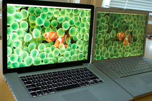
In case you were concerned about the MBP5’s new glossy screen, you were right to worry; its screen sucks. I am sure it has its impressive points, but I can’t really see any of them through all the reflections. It’s reflective to a point where it’s often distracting and sometimes unusable.
MBP5’s screen is also overtly bright. It’s so bright that I can’t really work on it with anything more than 4 (out of 16) levels of brightness without getting a headache. I think it needs to be this bright to actually manage to show you something through all the reflections. The trouble is, you’re soon dealing with both the ungodly reflections and a bright glow that’s giving you a headache, and the colours start to appear quite washed-out at higher brightness levels. Awesome!
While I am ranting about the screen, I might get these other things off my chest. The default colour cast for MBP5’s screen is a little too cold. (I believe this can be easily fixed with some calibration.) It’s interesting that the screen now opens up to a greater angle than it did on MBP1, but this is useless since the new screen has a reduced vertical viewing angle. As a sort of peace-offering for all its failings, MBP5’s screen does seem to have a greater horizontal viewing angle.
Finally, the glass cover over MBP5’s new screen makes it quite a bit heavier than the older screen. It no longer stays up under its own weight beyond a certain closing angle, and closed on my fingers when I once quickly moved MBP5 holding onto just its keyboard.
Evaluating performance gains using Cinebench
(Ed. Note: This section was appended after the original article was published.)
Once I’d publicised this piece a little on different fora around the web, it was brought to my attention that some people were interested in learning more about the performance differences between the two machines; one of whom was nice enough to suggest a suitable benchmark program, Cinebench. I’d glossed over the performance gains earlier, casually tossing out a “MBP5 is ~ 40% faster” line; something which I’m now going to rectify.
I’ve now run Cinebench R10 (800 x 600, 8 Bit RGB) on both machines (running Mac OS X 10.5.5, 32 Bit) , and the results reported below are the best of three attempts after a (hard) restart of each machine with nothing nefarious running in the background. In order to minimise any performance-eating shenanigans arising from power management, I set both machines to their respective “High Performance” modes and connected them to power.
| MBP1 | MBP5 | Δ | |
|---|---|---|---|
| Intel Processor | Core Duo (2 x 2.0 GHz) | Core 2 Duo (2 x 2.8 GHz) | |
| Memory | 2 GB (2 x 1 GB) | 4 GB (2 x 2 GB) | |
| Graphics Card | ATI Radeon X1600 | NVIDIA GeForce 9600M GT | |
| Rendering (Single CPU) | 1987 CB-CPU | 3217 CB-CPU | 1.62 |
| Rendering (Multiple CPU) | 3761 CB-CPU | 6147 CB-CPU | 1.63 |
| Multiprocessor Speedup | 1.89 | 1.91 | 1.01 |
| Shading (OpenGL Standard) | 2718 CB-GFX | 6142 CB-GFX | 2.26 |
It is heart-warming to note that MBP5 is quite a bit more nippy.
To make a long story less long
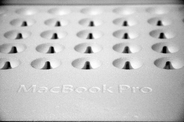
I don’t really know where I stand on MBP5. It has its good points: It’s a better spec’d machine in a lot of ways, it’s substantially faster than MBP1 (posting impressive gains in Cinebench, and ~ 40% gains on my unoptimised real-world numerical codes), it’s much better built, its battery life seems to be good (I got it to last nearly a couple of hours under heavy load, high screen brightness and WiFi turned on), the tiny, flimsy rubber dots raising the body of MBP1 have been replaced by large, sleek pads, …
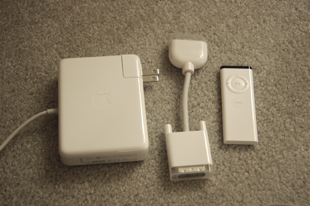
I just wish I didn’t have to logout-and-in every time I wanted to go from “Conserve Power” and “Maximise Performance” battery modes (a shift I’m used to making every single time I plug and unplug the power adaptor, but one that I can no longer afford to do), that I didn’t now have to remember to carry another dongle (Mini DisplayPort to DVI) everywhere, and that I didn’t hate its screen with such a passion.
