I haven’t written (or done) anything site related in a while, so here’s me filling that quota.
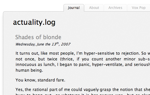
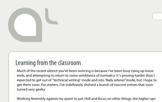
I just realised the other day that nearly 80% of my traffic still comes from Windows users and nearly all those readers arrive on various flavours of Internet Explorer (IE). Furthermore, since I hadn’t been on Windows or seen my journal in IE for a long time, I only recently realised that things look very different there from how they do on my Mac. And when I say “different,” I mean “unsightly,” which is not acceptable.
When I first “designed” this layout, I remember making sure that things looked reasonably similar across different platforms. I guess it’s just that over the years, the numerous tweaks I’ve been making to the interface have added up to significantly different appearances on different platforms. That being the case, I think now is as good a time as any other for a reset. Toward this end, I’ve started working on a new style that looks remarkably similar to the current one, but has two main goals. One, to simplify and streamline the back-end code. Two, to make things look and feel consistent across major browsers and platforms. (Sorry, my three fucking Opera users.)

The test page linked-to above serves to prototype and showcase the design. I’m trying to start with a clean slate by using CSS from the YUI Library from Yahoo. I’ll let you know how that works out. For now, notice how things look quite similar on two disparate environments: Internet Explorer 7 on Windows XP and Safari 3 on Mac OS X Leopard. I’m also maintaining a more detailed design status table covering different browsers and platforms.
At the end of this exercise, things should not be too different from what you’ve come to know and love. But over the course of the next few weeks, things might appear randomly broken as I move changes live into the journal. If you experience this, don’t panic. Go out, take a walk and by the time you get back, I should have things sorted out. If I seem to have missed something, do let me know!
