Twilet-down

It was around three o-clock in the morning. I was startled as my front door swung open and a dog rushed into my home! It took me a couple of seconds to recover and realise what was going on, and by the time I did, she was gone. It turns out that my neighbour upstairs had mistakenly opened my door after a night out, and her excitable dog that was with her got excited. Two things: 1. I’ve made this mistake before (more than once!), so it’s not a big deal. 2. People should really start locking their doors.

But why was I so startled? What was I even doing up at that hour?

I was violently flailing my arms around like a spastic trying to get my fucking character on screen to follow my directions. After spending over 50 hours over the past few weeks on it, I’d finally reached the main evil baddie of the Zelda game on the Wii (The Legend of Zelda: Twilight Princess), and I was still having difficulty getting my on-screen avatar, Link, to perform basic tasks; tasks that have been trivial to perform from day one in past Zelda games using “traditional” control schemes.

Link from The Legend of Zelda: Twilight Princess

Perhaps an hour later, I finally finished the damn game so that I could get back to other aspects of my life, but I still can’t get over how vaguely unsatisfying it all was. In the hope that ranting about it will help me get over it, I am going to pinpoint aspects of the experience that especially sucked:

  • The last two epic Zelda games that I played (The Wind Waker on the GameCube and Phantom Hourglass on the DS) oozed nothing but polish. Twilight Princess, on the other hand, feels hobbled together.
  • While I don’t inherently dislike the art direction (well, maybe I do), I hate the greatly varying quality in the visuals one is presented with over the course of the game. Some levels and characters are absolutely gorgeous, and others, well, are plain blocky and jagged.
  • The “fancy Wii control scheme” feels both tacky and tacked on. The controls aren’t as responsive as they should have been, and the camera is awkward to control. This really does feel like a GameCube game with some Wii stuff thrown in after the fact.
  • I know you shouldn’t turn to a Zelda game (or a Mario game, or a Metroid game, or any long-standing Nintendo franchise, really) for an epic original storyline. Things usually go something like:

    1. Stupid princess gets abducted yet again by the bad guy.
    2. You drop whatever it is you do and head out to rescue her.
    3. She thanks you, but obviously fails to learn that doors have locks on them for a reason.

    But Twilight Princess was particularly unsatisfying. The game is really linear, so you’re never lost looking for what you should be doing next, but the storyline fails to properly motivate any of it. The game doesn’t even try to develop any of its characters, save for one, so on some level you don’t really care if you live or die, whether the princess gets rescued, whether the bad guy gets defeated, or really, even who the main bad guy is.

  • There are very few real exploratory side quests and exploration is rarely rewarded. You see a suspiciously hidden chest far away; you figure out what you need to obtain to scale the mountain to get to the damn chest; only to see it contains a trifle of money, even which you can’t fit in your inventory. This sort of thing sucks the joy out of trying to explore and find things, and somewhere along the way, you stop trying.

I could go on and on like this, but I think I’ve worked the bile out of my system. I just hope the next Zelda game on the Wii is more polished and doesn’t leave a bitter after-taste when done. But however it turns out, I’m quite certain that the next Zelda installment on the DS, Spirit Tracks, will be enjoyable. I can’t wait for it to come out!

My shinier new computer

A month and three days, give or take a few months

One month and three days; that’s how much time had elapsed since I first ordered my shiny new Apple Macbook Pro (henceforth, MBP) and actually received it. As happy as I’ve been about how laid back people are here—and how much more relaxed my own life has become after moving to Oslo—it’s gratuitously long waits for just about everything (opening bank accounts, receiving my first salary, finding an apartment, getting this computer, …) that have tended to annoy me. But I think I’m going to save that rant for another time, as we seem to be veering off-topic a lot quicker than usual today.

I’d been keeping my eyes peeled for a new computer ever since I stepped out of grad school early this year. And since my existing MBP (first generation, early 2006 model) had served me well for so long (and continues to do so), it wasn’t surprising that I decided to eventually augment it with another MBP. I amn’t sure why it took so long, but only when the new crop of Apple notebooks were announced in mid-October was I both excited and intrigued enough to take the plunge.

A day after the new rigid-bodied, fully-glossy, black-keyboarded, easier-to-upgrade line was announced, I ordered myself one of the higher end MBPs. One month and three days later, I received it. It’s in this interim that my enthusiasm for the computer (and for this review in turn) seems to have waned.

But not completely extinguished.

The new machine on my desk.

Similar, yet different

When I first envisioned this piece, I imagined it to be some sort of spoof on my earlier (now nearly three year-old) review of my first Apple notebook, a first generation MBP. Retaining stylistic similarities, I wanted to faux reproduce the effusive excitement that came with my fledgling foray into the world of Apple and Mac OS X—mocking how much I associated that move to something of a noteworthy lifestyle change. I also wanted this review to stand alone, not marred in comparisons to that machine. But as usual, it appears as if this piece is going to evolve into whatever it wants to be—which is entirely comparative, and not particularly funny.

So without further ado, I present a complete list of specifications of my new machine, along with the specifications of my older machine to shed some light on where I’m coming from.

Early 2006 Model Late 2008 Model
  1. Also has an in-built NVIDIA GeForce 9400M graphics card with 256 MB of (total) VRAM.
  2. Note that this battery has been through over 836 charge cycles spanning nearly three years.
Model Name MacBook Pro 15” Macbook Pro 15”
Model Identifier MacBookPro1,1 MacBookPro5,1
Processor Intel Core Duo (2 x 2.0 GHz) Intel Core 2 Duo (2 x 2.8 GHz)
L2 Cache 2 MB 6 MB
Memory 2 GB (2 x 1 GB) 4 GB (2 x 2 GB)
Type (Bus Speed) DDR2 SDRAM (667 MHz) DDR3 SDRAM (1.07 GHz)
PCIe Graphics Card ATI Radeon X1600 NVIDIA GeForce 9600M GT1
Total VRAM 256 MB 512 MB
Display Type Matte Color LCD Glossy Color LED
Resolution (Color Depth) 1440 x 900 (32 bit) 1440 x 900 (32 bit)
Audio Card Intel High Definition Audio Intel High Definition Audio
Hard Drive Model Seagate ST910021AS Hitachi HTS723232L9SA62
Capacity 100 GiB 320 GiB
Drive Speed 7200 RPM 7200 RPM
Optical Disc Drive Matshita DVD-R UJ-857
Single Layer
Matshita DVD-R UJ-868
Dual Layer
Battery Model SMP ASMB012 SMP bq20z951
Full charge capacity 3219 mAh2 4585 mAh
Amperage / Voltage 2597 mA / 12446 mV 2168 mA / 11700 mV
Connectivity, etc. USB (x 2),
Firewire (400 MB/s),
Gigabit Ethernet,
Airport (ABG),
DVI Port,
Bluetooth,
Audio in/out,
ExpressCard/34 Slot
USB (x 2),
Firewire (800 MB/s),
Gigabit Ethernet,
Airport (ABGN),
Mini DisplayPort,
Bluetooth,
Audio in/out,
ExpressCard/34 Slot
Height x Width x Depth 1″ x 14.1″ x 9.6″ 0.95″ x 14.35″ x 9.82″
Mass 5.6 lb. 5.5 lb.

Henceforth, I’m going to refer to my new machine (fifth generation, late 2008 model) as MBP5, and the older one (first generation, early 2006 model) as MBP1. I think this notation will save me some typing.

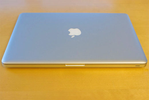
The two machines are quite similar in a lot of ways, yet I’ve convinced myself the differences between them are sufficient to justify this upgrade. When closed, and you stare at them from far enough away, the two notebooks appear just about the same.

Pretty similar, don't you think?

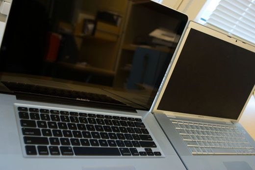
But as you get closer and you actually get to hold the newer machine, the physical differences between them become clear: MBP5’s keyboard now sports black, separated keys, the already lonely mouse button on MBP1’s trackpad is gone, the screen is now fully glossy and sports a black bezel (much like the iMacs), and most strikingly, it’s apparent how much better-built MBP5 is.

It does look and feel rather swanky.

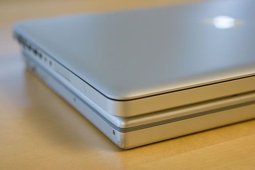
Apple has banged-on about their new manufacturing process innovations for quite some time now, and so I’m not going to repeat any of it. Even without caring about the details, the first thing I noticed when I pulled this machine out of the box is how much more rigid (and dense) it feels. The specifications on paper claim it is slightly lighter than MBP1, but I hold them up side-by-side and I can swear MBP5 is the heavier machine. Also, MBP5 is slightly thinner than MBP1, but in order to achieve this, they’ve made it wider and longer. Either way, you won’t really notice any of this unless you press them up against each other.

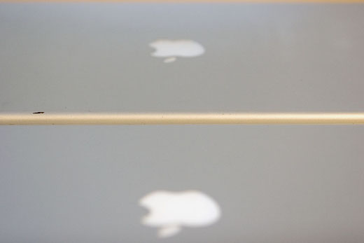
Subtle differences crop up on closer examination.

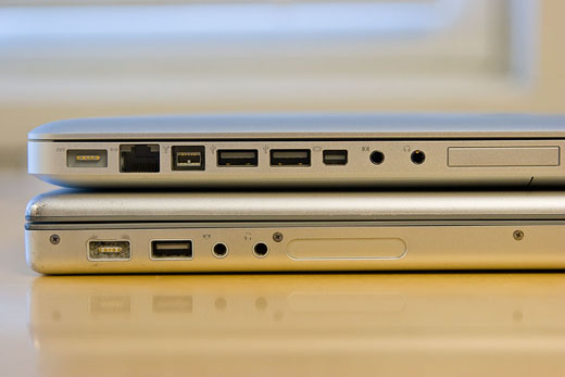
Since this section of the article seems to have become preoccupied with physical differences between the two machines, I might as well point out a few more things. First, all the ports have been moved to the left side of MBP5’s chassis, while they were distributed somewhat evenly between the left and right sides on MBP1.

A mess of ports, all on one side.

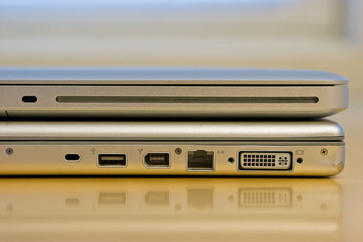
This also means that the slot for the optical disc drive on MBP5 has been moved to the right side of its chassis, instead of showing up at the front as in MBP1. These changes can either hurt or help depending on your set up, but either way, the drive on MBP5 sounds so much more tranquil—and not like it’s going to die every time it’s operated!

A quieter drive where all those ports resided.

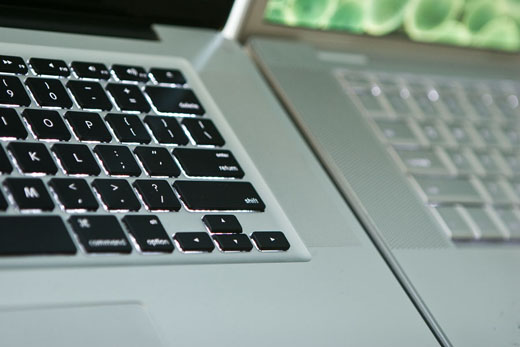
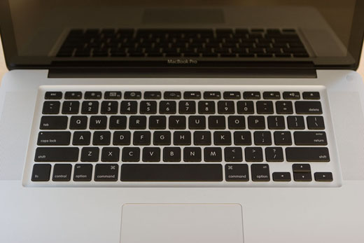
Also, even though the positioning of the keys on MBP5 feels identical to that on MBP1, some of the keys (especially the Function keys that open Dashboard, Exposé, help change the volume etc.) are mapped differently.

A birds-eye view of the new keyboard.

I’m a little thrown-off by this right now (like accidentally increasing the volume level on MBP5 by hitting F12, when intending to open Dashboard), but this is something I will adjust to soon enough and develop the appropriate muscle memory for. In more important news, that god-awfully placed Enter-key right next to the Left arrow-key on MBP1 is now gone! No more accidentally sending embarrassing typo-laden instant messages when you actually planned on moving the cursor left to an earlier point to correct your message. Thank you Apple!

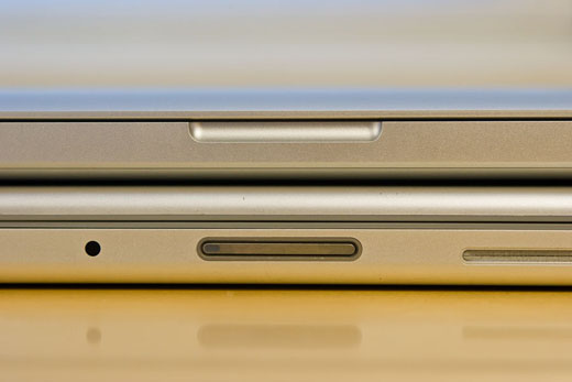
Finally, unlike MBP1 which uses a physical latch to stay closed, MBP5 uses a magnet. While this is cool (it really seems to shut snug), my fingerprints will probably end up smudging the glass covering the web cam—since that’s exactly where my fingers need to be to open this magnetic “latch.” Genius.

The new magnetic latch.

Some false alarms

Once the initial excitement of actually holding the machine in my hand had passed (recall I waited over a month for it), I proceeded with the cursory visual inspection of the body and then turned it on to check its behaviour. Within the first few minutes of use, it was apparent to me that I really liked the new keyboard. MBP5’s keys were a bit stiffer and typing on it had a really solid feel. In case you are worried about the new spacing between the keys (as I was), don’t be; it’s a non-issue.

Another thing I was unsure about was how the new button-less trackpad would behave. After using it for a week, I can testify that MBP5’s trackpad feels smoother, and the process of clicking is identical to that on MBP1—even though you can’t see a button any more. However, the clicking noise MBP5 makes sounds yuck compared to MBP1 (MBP1 sounds smoother and more understated while MBP5 sounds cheap and clicky). I haven’t gotten around to using (more than two-fingered) gestures yet, but I guess they will work as advertised. Most salient from my point of view, none of my usual finger movements on the pad have been accidentally construed to be gestures; which is always a good thing.

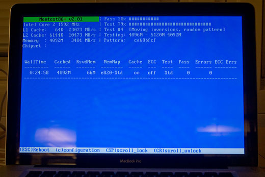
After working through the initial set up (for the first of three times—when I first switched-on the computer, when I formatted it and reinstalled Mac OS X to remove auxiliary crud, when I needed to reformat it and re-reinstall Mac OS X because I later found out many programs dislike a case-sensitive file-system), I did what I always do when I get my grubby-little hands on new hardware: Put it through its paces. Popping in an Ubuntu CD lying around, I fired up a memory test (imaginatively named “Memtest”) and let it run for a few hours.

Memtest chugging away.

Much to my dismay, the test failed quite spectacularly, indicating I had faulty memory. I was annoyed and disheartened not because of the failure, but because of the prolonged holdup I knew I would experience trying to get the faulty memory replaced in Norway. Thankfully, it ended up being just a silly software versioning issue, and MBP5’s memory wasn’t to blame. I guess the older version of the software just wasn’t aware of fancy Apple proprietaryisms. I’ve since run more recent versions of Memtest on the machine over several hours and there haven’t been any problems.

One thing I noticed during the test (which, apart from taxing the memory, is also a fairly processor-intensive task) is that MBP5 runs a smidge cooler than MBP1. The newer system’s cooling fans seem to be kicking-in earlier. While this is good news for you if you ever plan on having children, it makes MBP5 quite a bit louder.

Talking about noise levels, I would be remiss if I didn’t point out that MBP5 is completely non-whiny! This is in stark contrast to MBP1, which has different kinds of high-pitched electronic noises emanating for certain screen brightnesses and when its processors aren’t being used.

The real alarm

In case you were concerned about the MBP5’s new glossy screen, you were right to worry; its screen sucks. I am sure it has its impressive points, but I can’t really see any of them through all the reflections. It’s reflective to a point where it’s often distracting and sometimes unusable.

Ooh, I'm shinier!

MBP5’s screen is also overtly bright. It’s so bright that I can’t really work on it with anything more than 4 (out of 16) levels of brightness without getting a headache. I think it needs to be this bright to actually manage to show you something through all the reflections. The trouble is, you’re soon dealing with both the ungodly reflections and a bright glow that’s giving you a headache, and the colours start to appear quite washed-out at higher brightness levels. Awesome!

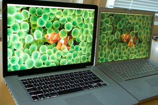
While I am ranting about the screen, I might get these other things off my chest. The default colour cast for MBP5’s screen is a little too cold. (I believe this can be easily fixed with some calibration.) It’s interesting that the screen now opens up to a greater angle than it did on MBP1, but this is useless since the new screen has a reduced vertical viewing angle. As a sort of peace-offering for all its failings, MBP5’s screen does seem to have a greater horizontal viewing angle.

Voyeurs on the bus, rejoice!

Finally, the glass cover over MBP5’s new screen makes it quite a bit heavier than the older screen. It no longer stays up under its own weight beyond a certain closing angle, and closed on my fingers when I once quickly moved MBP5 holding onto just its keyboard.

Evaluating performance gains using Cinebench

(Ed. Note: This section was appended after the original article was published.)

Once I’d publicised this piece a little on different fora around the web, it was brought to my attention that some people were interested in learning more about the performance differences between the two machines; one of whom was nice enough to suggest a suitable benchmark program, Cinebench. I’d glossed over the performance gains earlier, casually tossing out a “MBP5 is ~ 40% faster” line; something which I’m now going to rectify.

I’ve now run Cinebench R10 (800 x 600, 8 Bit RGB) on both machines (running Mac OS X 10.5.5, 32 Bit) , and the results reported below are the best of three attempts after a (hard) restart of each machine with nothing nefarious running in the background. In order to minimise any performance-eating shenanigans arising from power management, I set both machines to their respective “High Performance” modes and connected them to power.

MBP1 MBP5 Δ
Intel Processor Core Duo (2 x 2.0 GHz) Core 2 Duo (2 x 2.8 GHz)
Memory 2 GB (2 x 1 GB) 4 GB (2 x 2 GB)
Graphics Card ATI Radeon X1600 NVIDIA GeForce 9600M GT
Rendering (Single CPU) 1987 CB-CPU 3217 CB-CPU 1.62
Rendering (Multiple CPU) 3761 CB-CPU 6147 CB-CPU 1.63
Multiprocessor Speedup 1.89 1.91 1.01
Shading (OpenGL Standard) 2718 CB-GFX 6142 CB-GFX 2.26

It is heart-warming to note that MBP5 is quite a bit more nippy.

To make a long story less long

I don’t really know where I stand on MBP5. It has its good points: It’s a better spec’d machine in a lot of ways, it’s substantially faster than MBP1 (posting impressive gains in Cinebench, and ~ 40% gains on my unoptimised real-world numerical codes), it’s much better built, its battery life seems to be good (I got it to last nearly a couple of hours under heavy load, high screen brightness and WiFi turned on), the tiny, flimsy rubber dots raising the body of MBP1 have been replaced by large, sleek pads, …

I just wish I didn’t have to logout-and-in every time I wanted to go from “Conserve Power” and “Maximise Performance” battery modes (a shift I’m used to making every single time I plug and unplug the power adaptor, but one that I can no longer afford to do), that I didn’t now have to remember to carry another dongle (Mini DisplayPort to DVI) everywhere, and that I didn’t hate its screen with such a passion.

Stars among us

Emerging from the south of my country, moreover so from a city and community rife with anti-Hindi sentiment, it’s not surprising that I hadn’t seen a single Hindi movie during the course of my entire life. All that changed a couple of days ago, when my kin dragged me along to a screening of Taare Zameen Par, a quaint little feature with a moving social message.

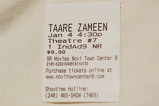
Hindi movie ticket

It’s because of this heartwarming message and the wonderful acting all across the board that I’m willing to overlook the fairytale ending, the needless random breakouts into song and dance, and the overly colour-saturated cinematography, to proclaim that it was a very moving and delightful experience; something which I had least expected.

I can heartily recommend this movie to anyone who’s curious about what Indian cinema has to offer (it screens here complete with well-written English subtitles) though I recognise that it isn’t even remotely representative of the standard fare, to anyone who knows someone with a learning disability or mental handicap, or to anyone who’s experienced a certain very third world mentality I try hard to rally against: That if you’re not the absolute best at what you do, be it anything from not scoring at the top of your class in an inconsequential test in first grade, to not earning the most amongst your peers upon completing your education, you’re an utter failure.

In summary, if you belong to any of those groups, please try it. You won’t be disappointed.

My shiny new computer

Written in Aquamacs, a GNU Emacs rebuild for OS X.
Photos taken with a Canon EOS 20D and managed in iPhoto.

Foreword

I’ve had this new MacBook Pro (henceforth, MBP) for about 48 hours now. Apart from the obvious pauses for sleep and food, I’ve spent almost every other waking moment setting it up, toying with it and generally putting it through its paces. This article is going to be long-winded. It will not get technical, doesn’t really have a point, and you don’t have to read it if you don’t want to. I am not envisioning it to be a comparison with the ThinkPad T60p (T60p, from now on), but if differences that I want to point out crop up, I will go ahead and do just that.

Where I’m coming from

Whenever I read an opinion piece, I’m curious to know where the author is coming from. I mean, without some insight into her background, I often fail to comprehend or appreciate her position; so I’ll try to extend you the same favour.

I’m in my mid-twenties, literally, and have been around computers since I was 2 (two). I could be classified a “power user,” who’s been building his machines since his early teens, and am not afraid to stick a soldering iron even into the shiniest notebook casing. In time, I’ve worked on a variety of different platforms, but I’ve primarily (and always) had access to Intel processor based “machines;” making it the platform I am most comfortable with. It is for this very reason that Apple’s recent shift to Intel processors did excite me, and made their computers a viable choice.

On the software front, I used, exclusively, a fair amount of proprietary DOS-like OSs and probably half a decade of Windows until the mid–late 90s. Circa ’96, I installed my first ever GNU/Linux distribution, a modified version of Red Hat Linux 4.0. A process of migration to fully Free software (denoted by a capital ‘F’) that begun then was completed a few years ago, and I’ve been very happy with the state of affairs. Consequently, I have been out of touch with recent developments in the Windows world, and haven’t really used Mac OS (X) before. In terms of programming, I’ve dabbled in everything from the lowest levels of assembly, through mucking around with device drivers, to more-pleasant high level languages such as Python—which powers parts of this web site you’re reading.

By day, I am a computational scientist, and earn my daily bread working on developing and coding-up numerical methods to solve real-world problems. On paper, I am a graduate student working on multiple degrees, culminating at a PhD or two. Clearly, I do know a thing or two about technology; but needless to say, I have few friends and a non-existent social life.

The purchasing experience

Unlike my first time around, where there was an annoying delay of numerous weeks during which I cancelled and ordered a T60p, this time the purchasing experience was very pleasant. I received the refund for my returned T60p on a Tuesday morning, and ordered this machine later in the afternoon. They’d estimated that it would take a few days to ship, and many days post that to actually get here from China, The People’s Republic of.

But it turned out that they shipped a couple of days later, Thursday, and it showed up at my doorstep on Friday morning!
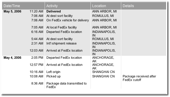
Fedex shipping history.

There are numerous web sites out there cataloguing a vast collection of packaging porn, so I’ll just stick to a couple of basic pictures highlighting the fact that the packaging was indeed slick.
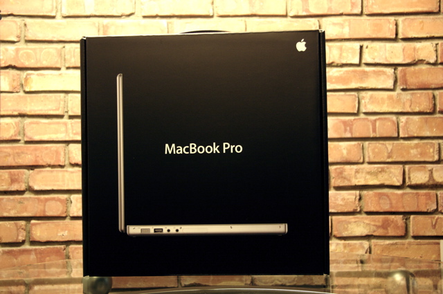
The sexy box.

The sexy box, on its side.

Thermocole

First moments

Since I was a bit in surprise-shock land, it took me a few moments to realise that I was holding another new toy in my hand. I unwrapped it carefully, trying not to mess meticulously designed packaging, and soon had the few real items out of the box. For the curious, this is some of the stuff it ships with, and some glamour shots of the machine itself.
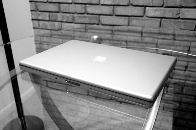
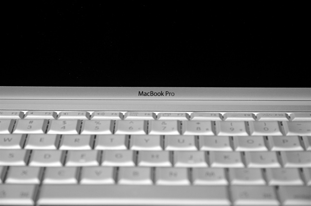
Out of the box.

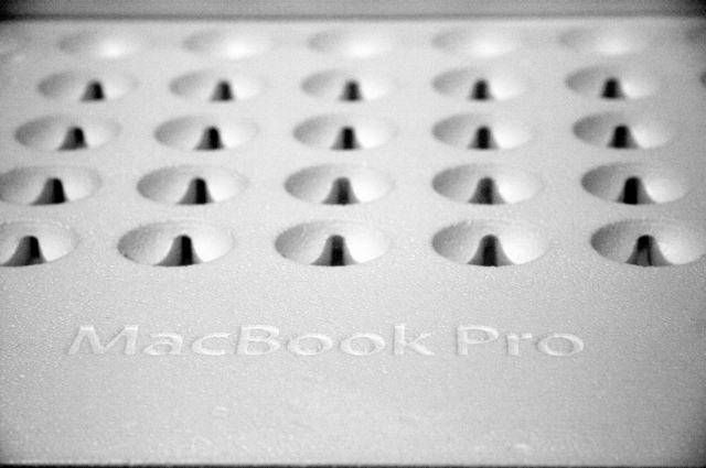
The name

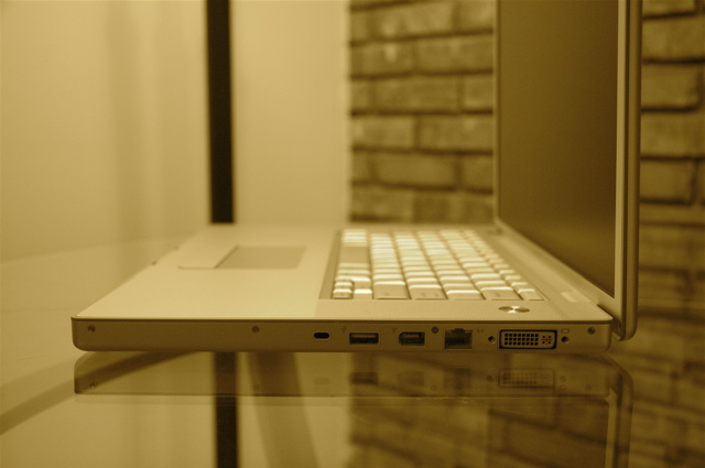
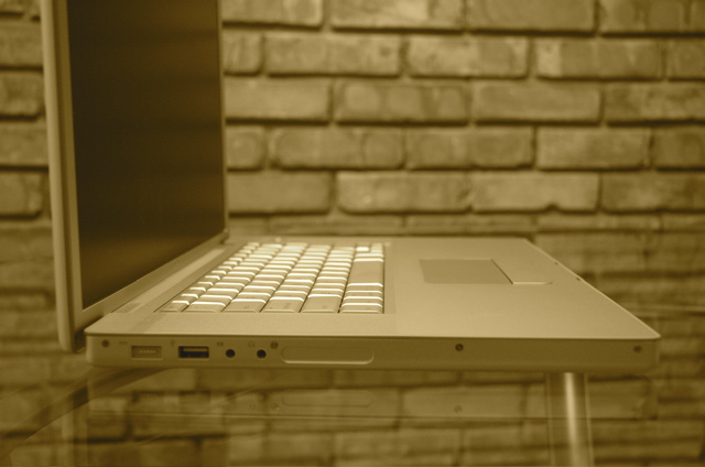
The ports

The ports

At an angle

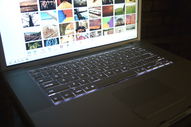
The lit keyboard.

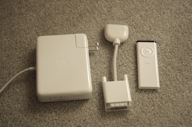
The other things.

There was little to do besides plugging in the (obese) power brick and the ethernet cable, and powering on the machine to soon be greeted by a flashy OS X welcome screen and scary information-extraction dialogs. I call these dialogs scary, because within the first 30 seconds (after it asked me for my “Apple ID”) it knew everything about me. Who I was, where I lived, and credit card information in case I needed to “fetch tunes from iTunes.” For a frickin’ fee, of course.

The machine booted quickly, and I soon gave it the obvious careful look-through for things like dead pixels and so on. There were none, however the bottom screen corners were vaguely darkened too, like the T60p, but just a little bit less noticeable. If I peer long and hard enough, I can swear there’s some uneven backlight-leaking sort of issue, but that’s also probably just me.

It is slick, thin and very beautiful, but although on paper the machine is lighter than my T60p, and seems so much thinner, it feels heavier in my hand. It’s like though my brain understands the notion of density and recognises that objects don’t scale in weight by dimensions, it is unable to get rid of the idea that the MBP “is this small”, and can hence “ought not to be more than a certain weight.”

It does get very warm, but after quite a while, I’ve realised that the temperature of the computer is very dependent on the temperature of the room you’re working in. If your room is nice and cool, all is actually quite fine, but if you’re in an already warm room, be prepared for some sweaty palms. And this really irked me, because I am a softie, and haven’t really sweated a day of my life. Yes, I’m also proud of my lack of defined shoulders.

The battery life, 3 hours plus, is directly comparable to what the T60p gave me with the 6-cell battery. I was very pleased with it then (hey, I’m coming from a dying old laptop that can’t hold charge for more than 16 minutes), and I am very pleased with this now. At the end of the day, if I lower the fan turn-on threshold temperatures on this notebook, it will have the same noise-levels and degrees of coolness as the T60p. The quality of the speakers are far superior, but as for the mike, I have to say that the T60p did a better job. It does have, however, digital sound input/output and a DVI port for those who need it. (I don’t).

It is definitely less rugged, but it turns so many more heads. At this point in my life, I’m afraid I have to admit that this is what I am lusting after. I am emotionally attached to this machine (you know, the connection you really want to make), and thus numerous technical and philosophical reasons not to own one have been thwarted.

Onto Mac OS X

Near-first boot.

Everything about this OS is a little “too slick,” in that often, you’re really a little bit too abstracted from what is going on; even if you really want to peek under the hood. Upon first boot, I realised that the default installation of the OS and a few applications used-up over TWENTY-FIVE GB. Realising that this was unacceptable—as I know you agree—I proceeded to reinstall OS X from the restore discs. Plus, I’m a geek and I was curious to see how the process goes, and it gave me the chance to ensure that the recovery discs were fully functional before a real emergency.

It turns out that I had to do the reinstall a couple of times, because I MISSED the tiny “Customize” button (which allows you to pick what components you wanted installed and what you didn’t) the first time. This is the sort of thing I’m talking about. It happens all the time, and sometimes I wonder if they’re doing mere mortals a huge disservice by dumbing things down so much. The computer is a complex device; it needn’t be presented sugar-coated such that it seems like something a toddler could—and would love to—ingest. Or should it?

I’ve also realised what it is that GNOME is trying so hard to be. Many design elements I note in OS X have been incorporated into GNOME in one way or another, and it’s clear that they’ve picked the right envronment to emulate and improve upon (*cough* unlike KDE *cough*).
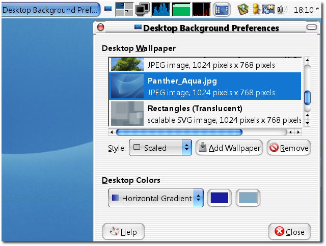
GNOME desktop

Steps needed to accomplish tasks are not always the fastest ways of going about things (because I am not comfortable with the keyboard shortcuts as of yet), but most things in OS X “just work” the way you’d expect them to. I will be lying if I said that I weren’t impressed. I needed to install very little additional software on the base machine before I got productive (e.g. Mathematica, LaTeX), and there exist clean, competent applications for most normal things you’d generally love to do, like showing-off photos in an impromptu slideshow in iPhoto at the coffee shop.

Apple's iPhoto

Chicks dig this. Or at least I’m banking on the fact that they will.

But it turns out that the killer app for me—Mozilla Thunderbird—is still not a universal binary yet. So while Camino (a gecko browser which happens to be compiled for Intel Macs) starts up in less that 1.5 bounces of the icon (the Mac-head unit of time) the first launch, Thunderbird still takes 12 or so for its first start-up. Nevertheless, I was able to easily get it to import all my e-mail from my older computer without anything going horribly wrong.
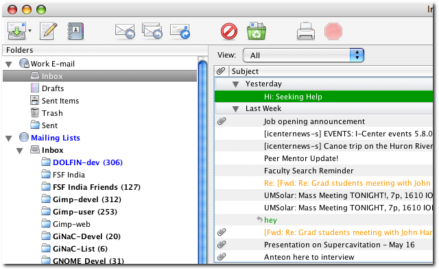
Mozilla Thunderbird

It is the only application that has misbehaved so far, and arbitrarily crashed on me once.

I’ve sort of figured out that installing and uninstalling—for the most part—are no-brainer tasks, but I’ve still not figured out how to uninstall something if I don’t know for sure how it was installed in the first place. As in, whether someone dragged and dropped the colourful icon into wherever it ended up at, or whether an “installer was clicked-through” to install it. Ah well, I’m sure the resident Mac-heads will know.

People kept touting applications like Spotlight and Dashboard to be “killer apps.” but I must say I was sceptical. It turns out, I use Spotlight just like Deskbar, and there is almost no other interface needed for anything, whether it be open a document you only vaguely know the name of, or whether it be to start an application whose name you’re too busy to remember or… . Spotlight is amazing, just like what Beagle and Deskbar are trying to be. You log in, and begin to type a query related to what you’re looking to do/for on Spotlight and BAM!, a second or two later, you’re there!
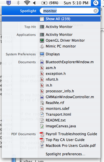
Apple's spotlight

Another brilliant addition is Dashboard, which is like Yahoo!’s Konfabulator or google’s widgets which are these simple apps (think Thesaurus, Calculator) which you use all the time during the course of normal computing—but all on an easy to access interface. I thought it was overtly shiny and gimmicky at first, but it turns out that I do tend use the Dictionary/Thesaurus a lot when I type things up—like this document. One to convince myself that I spelt a word right even though text-editors’ US-English dictionaries claim otherwise, and the other is to sound smarter than I really am.
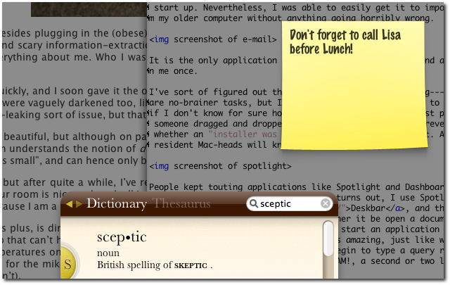
Apple's Dashboard

All is not necessarily glowing, of course. I did have some beef with the console interface. I am not a long time Unix user, I’m a long time GNU/Linux user. There is a disctinction here which normal people with real lives might not notice, but I’m used to GNU userland applications which almost all provide nice, human readable output and “long options” (--verbose --all, anyone?) for input. All useful apps have colour coded output and everything works with a --help in case you need something to get started. But not on OS X. Oh no, this is seriously old school Unix under the hood where you type ls --all and it’ll balk out an error regarding the --. Try it.
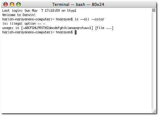
BSD useland

And in conclusion

All in all, I have taken a liking to the machine. The gimmicks like the glowing keyboard and remote don’t seem like gimmicks anymore when you put them to useful applications. OS X might be unduely shiney and the console it provides is dogged old Unix, but it’s still a Unix. It took me almost no time to get up to speed with the apps and libraries and such I needed to get productive; all the while running a virus scan and watching QuickTime movie trailers on the same box. An eery experience to say the least.
OS X

Women’s entertainment? – I/III

On occasion, I’m overly drawn into a program on “Lifetime,” a woman’s entertainment channel. And by “overly drawn into,” I obviously mean that the remote is missing, I’m too lazy to move, and watch whatever is on; even if it’s the Lifetime channel.

Yesterday evening was one such occasion. I happened to chance upon a most ‘B’ of B-movies, whose name I’ve already forgotten; or probably never knew in the first place. It was such an experience that I must share its wonderful story with you. Enjoy! (Suckers).

This story is about a young couple who’re madly in love—and sexually hyperactive—a detail that’ll play an important role in the story’s progression. Besides, it’s some unwritten rule somewhere that no-name actors and actresses must show a lot of skin, or they don’t stand a chance. Anyway, all is well initially as the guy who’s a PhD in astrophysics (and this has no bearing on the story whatsoever) and the woman who’s a children’s book author—and relatively cute, by B-movie standards—go about their wonderful life.

But one day—cue ominous tune—it all starts going horribly wrong.

It turns out that this young woman has some seriously terminal illness, like lung cancer or something, and about a quarter way through the movie, is very ill, and is soon doing gross things like coughing up fake blood. Since I doubt that few people would want to sleep with someone who’s throwing up blood (other than the odd lazy vampire, I guess), their sex life begins to suffer.

But our poor man has needs. Of course he does. So he soon begins cheating on this wife with this other B-movie-league-attractive woman who happens to be a real-estate agent. The side perk of this being, that they then get to copulate in all different sorts of bedrooms in fancy homes she’s supposed to be selling! Meanwhile, the poor, sick wife (who’s still hot in a sort of, “you can get to be totally protective of her, and she’ll be all yours,” way) joins a support group.

A support group for people who also cough-up blood while waiting for other people to die, so that they can hopefully get the lung transplant they need to live. Yes, your typical fun-times crowd.

Riveting stuff, if any of these people could act. You’d think they’d have just ended this train-wreck right there with a message like, I don’t know, “smoking kills” or something. At least the kiddies would have learnt something.

But noooo, our writers have other plans.

The GameCube Page

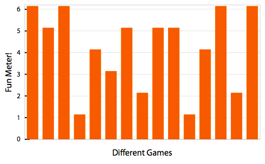
Game ratings graph

I recently [October, 2004] bought a Nintendo GameCube. I’m sure it will rock, but I don’t really have many games or accessories for it yet. Here’s what I own so far, in inverse chronological order:

Games:

  1. Mario Kart: Double Dash!! — The most fun you and a bunch of people will ever have! [6/6]
  2. Resident Evil – 4 — Action-packed, but deviates too much from the puzzle-heavy forte of its brethren [5/6]
  3. Metroid Prime 2: Echoes — Though the story had little to do with metroids, it felt just like the original, only better [6/6]
  4. Prince of Persia: Warrior Within — They took all that was good about the original, and threw it out the window [1/6]
  5. Animal Crossing
  6. Metal Gear Solid: The Twin Snakes
  7. Viewtiful Joe – 2 — More of the exact same goodness, but too short and tends to be repetitive [4/6]
  8. Super Monkey Ball – 2 — Mostly pick-up-and-play fun, but cheesy and simplistic gameplay [3/6]
  9. Resident Evil Zero — Subtle tweaks make it better than the original [5/6]
  10. Need for Speed Underground — An occasionally interesting game that’s a little too ghetto, and a little too aliased [2/6]
  11. Viewtiful Joe — Beautiful, stylish and slick old school fun, but can be very challenging [5/6]
  12. Pikmin
  13. Prince of Persia: Sands of Time — Short and easy, but insanely fun with an engrossing story [5/6]
  14. Luigi’s Mansion — I am still in shock that this is a first-party Nintendo game [1/6]
  15. Resident Evil — Frighteningly gorgeous, intelligently fabricated, with some awkward control issues [4/6]
  16. The Legend of Zelda: The Wind Waker — Beyond awesome, absolutely loved and worshipped [6/6]
  17. Super Mario Sunshine — Pleasant at a few points, but in general extremely tedious [2/6]
  18. Metroid Prime — Diverse, vast, beautiful and immersive [6/6]

Accessories:

  1. Nintendo Memory Card 59
  2. GameCube WaveBird Wireless Controller — Platinum
  3. Nintendo Memory Card 1019

If you know of other stuff to add to improve my now-sorry list, I’d love to hear about it. That way you can be the zealot you always wanted to for your favourite games, and I can reduce the amount of research I need to do before buying a new game. It’s a win-win situation!

Current open suggestions:

(Thanks!)

  1. Super Monkey Ball – 1
  2. Paper Mario: The Thousand-Year Door
  3. Super Smash Bros. Melee
  4. Pikmin – 2
  5. Eternal Darkness: Sanity’s Requiem
  6. Mario Power Tennis
  7. Prince of Persia: The Two Thrones
  8. Freedom Fighters